
Software Used: Adobe Photoshop
I rarely get to work in collaboration with other artists. But for this project, all the sketching was done by Pia's mother, who herself is an artist. Which, a) allows me to focus on other aspects of the design and b) I get to watch another artist create, which is always fun!
The basic idea for this project was integrating the harp, Pia and her mothers' art. The question at this point was what do we want to create with these three elements.
Due to COVID-19 Pia didn't get around to taking the photos for the album, or even shoot her video (more on the video later). So we created a studio in my home in Brooklyn and took a bunch of pictures based on ideas we had for the potential cover. We selected our favorites and sent them over to her mother in Brussels, Belgium, who then sent us back some really cool, abstract designs of Pia and her harp based on the pictures we took.
Now having all the material we needed the brief looked a little like this.
Brief:
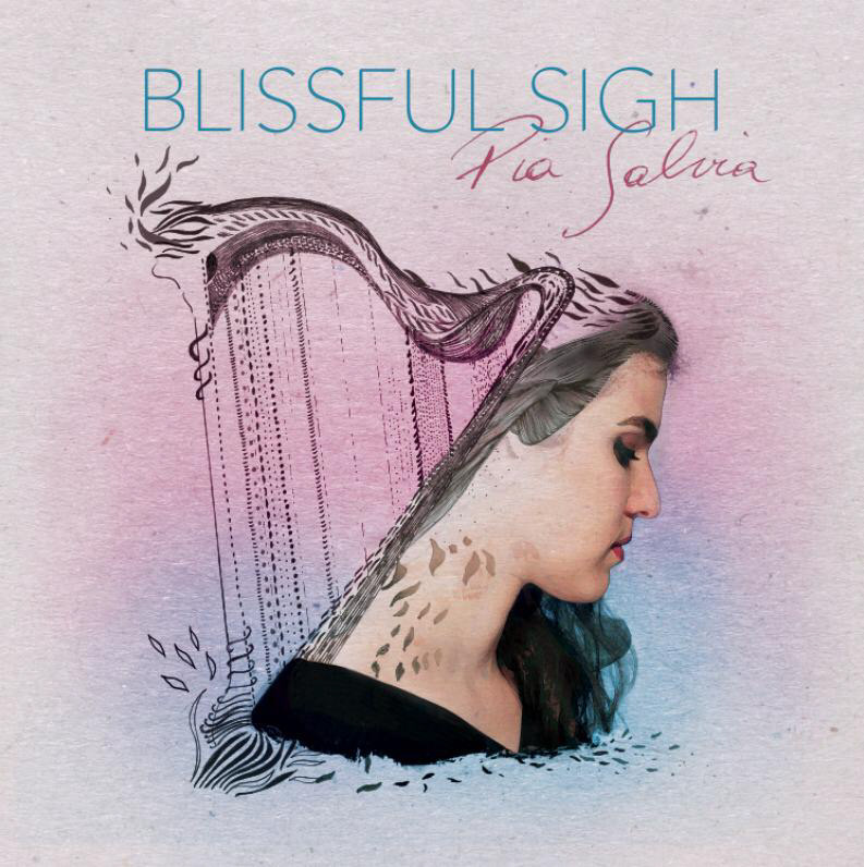
Centered image of Pia facing one way and the harp facing the other way - almost back to back. The harp will completely be based on the design her mother created and her face will be a merge of the original photo (with loads of editing) and her mothers design.
The color scheme should be a pink with blue haze.
Based on this, the first drafts was created shortly after:
Draft 1 - Option 1
Draft 1 - Option 2
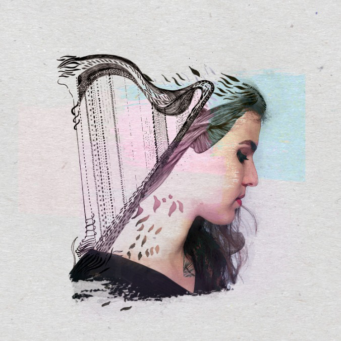
Additional Blue/Pink hazing options
With a definite step in the right direction, Pia felt it wasn't colorful enough even with the pink and blue hues. So we expanded them, A LOT.
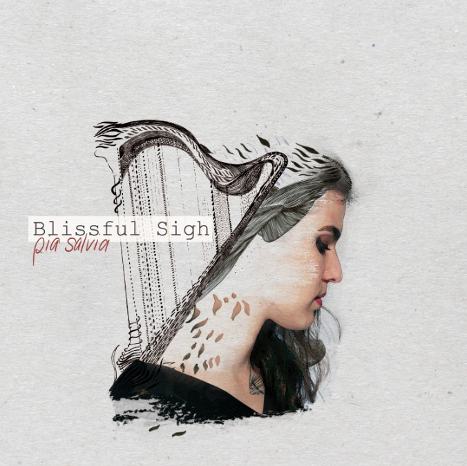
As for the text, she liked the mix of type font and handwritten but wasn't convinced of the two that were there. So we actually opted for her signature on her name and a more modern and sleek font for the next step.
Lastly the debate was on whether to lean more on the blues or the pinks.
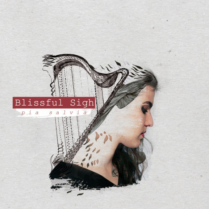
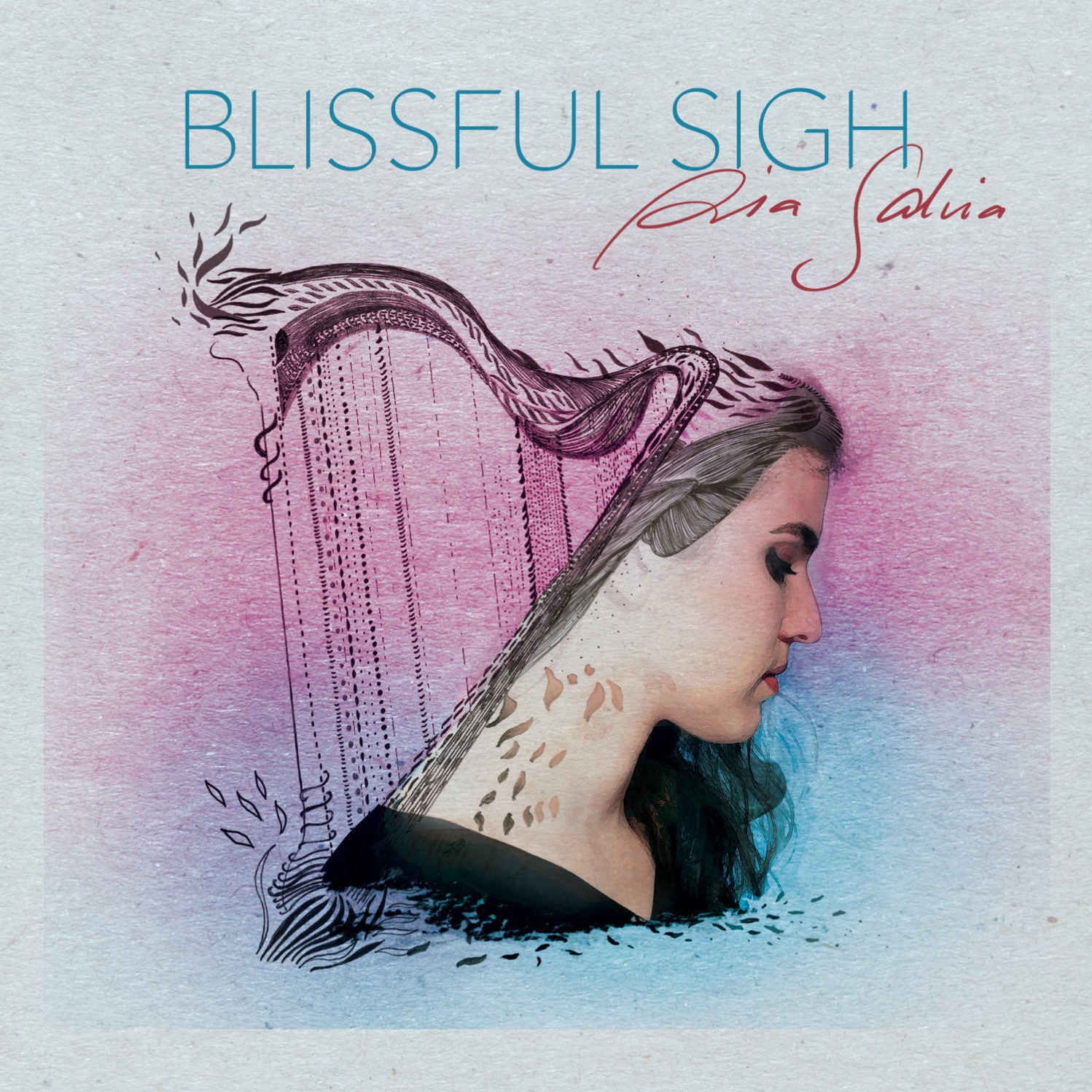
And after getting a bunch of outside opinions we eventually settled for the pink, giving us our final product:
And after getting a bunch of outside opinions we eventually settled for the pink, giving us our final product:

HA! You thought that was it? Pia was actually also working on releasing a single with this album along with a music video and the whole shuh-bang.
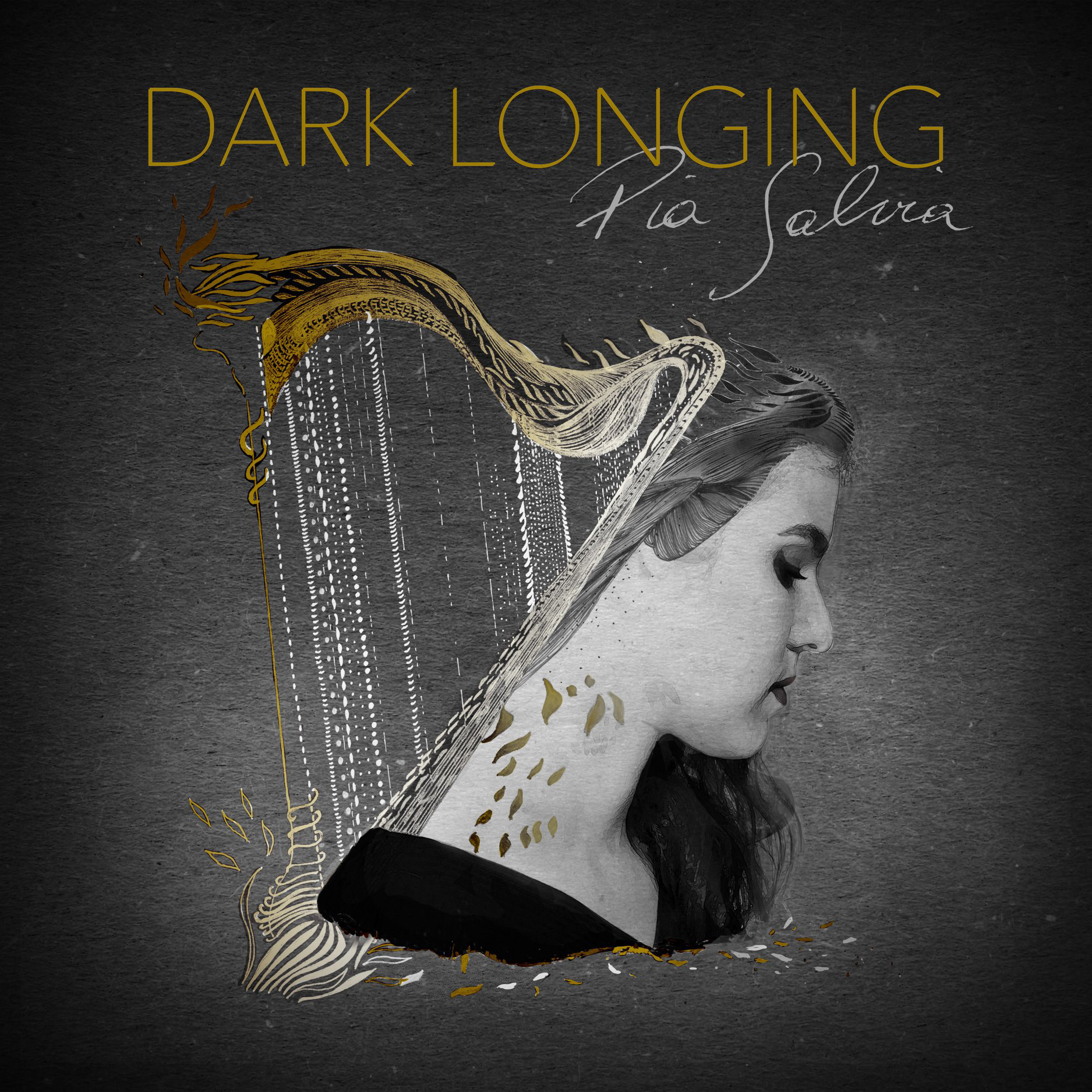
Since it's a track from the album, she decided to stick with the same general design and just tweak the colors. The single, 'Dark Longing', as the title states is very dark and vibey, so we tweaked and created this:
Since it's a track from the album, she decided to stick with the same general design and just tweak the colors. The single, 'Dark Longing', as the title states is very dark and vibey, so we tweaked and created this:
The plan had always been to print the CD with a booklet and all, in part also to thank all of her supporters - so we went ahead and created all of those designs as well. But if I show you... who's gonna support her and buy the album?? ;)
I keep mentioning the music video. If you want to go and watch it and see how we created it click here.
I keep mentioning the music video. If you want to go and watch it and see how we created it click here.
And to go hear the full album, including the single, head on over to Spotify right here!